

CORTEVA
A bold vision for an AgTech innovator: a UI approach that extends Corteva’s human-centric rebrand across its website family.
Context
Corteva is an agricultural tech company using AI to address food security, energy transition, biofuels, and climate change.
Challenge
Corteva needed a UI approach that extended its human-centric rebrand to its family of websites, while also identifying ways to better reach policymakers and informed consumers.
The Rebrand
In an ever-changing landscape, both literally and figuratively, Corteva sought to solidify its authority in a highly regulated industry. A site refresh would clearly communicate its mission, values, and ethics, put humans first, and reflect its new visual identity.

Aligning a Vision
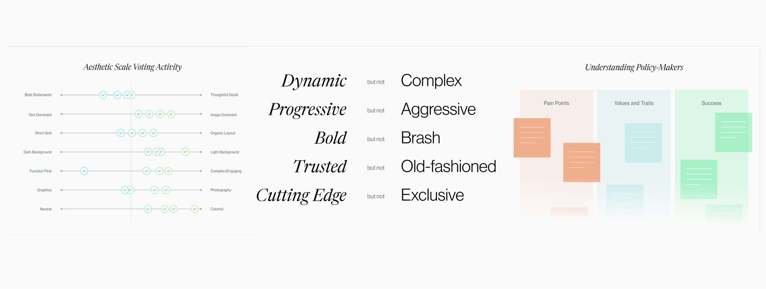
Stakeholder interviews and exploratory conversations informed interactive workshop exercises, including audience analysis, a competitive landscape audit, a brand personality assessment, and aesthetic mapping.
Visual Exploration
Four visual directions showed how the rebrand’s new elements could combine in different tones, each targeting a different facet of Corteva’s brand personality.
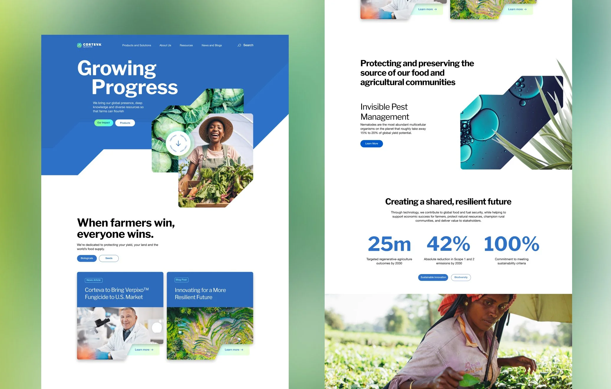
Friendly and Progressive
This concept plays up the friendliness of Corteva Blue as a backdrop for accents of the gradient in calls to action and to emphasize text.
Rounded buttons and soft shadows support the approachability of this concept, while growth shape modules and images reinforce Corteva’s upward momentum.
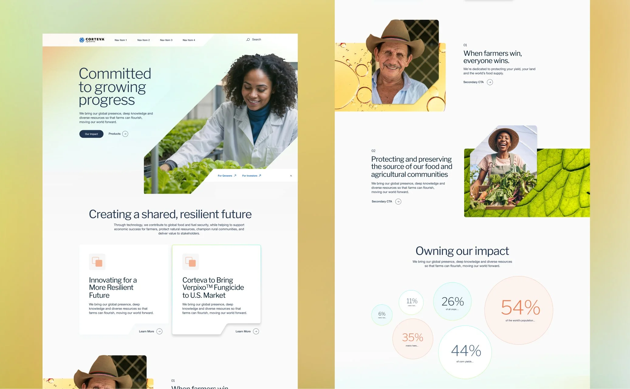
Trustworthy and Cutting Edge
Light, airy, and scientific. A subtle use of color and gradient highlights imagery, key content, and calls to action.
The generous use of whitespace and thin line weight add to the airiness of this concept while crisp edges on CTAs emphasize authority.
Modern and Vibrant
This concept leans into the gradient in a sophisticated way, using reduced opacity for module backgrounds so imagery stays the star.
A slightly off-white background keeps the colors vibrant yet friendly, while circular stats and text-link icons add playfulness.
Dynamic and Bold
Nature Blue serves as the foundation for vibrant gradient accents in text and calls to action. This concept feels daring yet highly credible.
Full-bleed imagery, subtle highlights, and micro-animations bring the page to life as users interact with the content.
Closing